Art Pieces
-
![]()
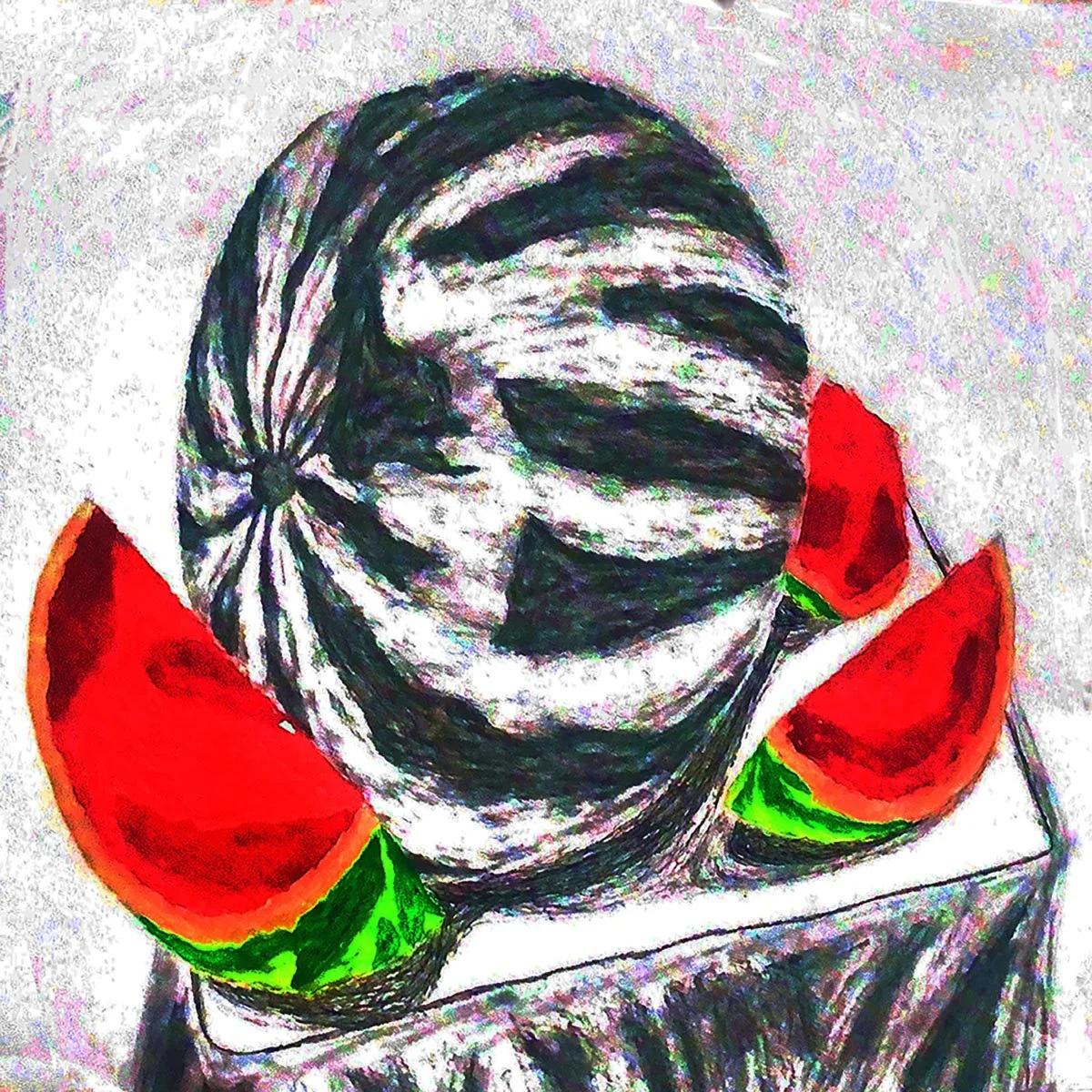
Watermelon
Context: This piece is based on an in-class still life assignment I did years ago. I still had the original photo on my phone, so I decided to revisit it and create an updated version. I thought it would be fun to explore a mixed media approach, where I could highlight the contrast in color between the cut and whole watermelon.
Medium: I used 18in x 24in mixed media paper, applying various materials to enhance the visual interest. Watercolor was used for the cut watermelon, pencil for the uncut one, and charcoal for the drapery. Ink was added for the board separating the watermelon from the drapery, as well as for shadowing. Once complete, I scanned the piece into Photoshop and made adjustments to the hue/saturation, vibrance, and brightness/contrast to refine the final piece.
-
![]()
Niles Cats
Context: These two pieces are of my close friend's cats, created on separate canvases months apart. The top one features Luna and was a Christmas gift, while the bottom one is of Xylo, another cat he received months later. I wanted to use different mediums for each piece to create an asymmetrical look, representing the contrast in their personalities.
Medium: Both were done on 9in x 12in sketchbook paper. Luna was illustrated with ink, while Xylo was drawn in graphite. After completing them, I scanned both pieces into Photoshop and combined them into one cohesive image.
-
![]()
Self-Portrait
Context: This self-portrait, created years ago, was an experiment to explore my art style using mixed media. I wanted to understand how each medium could contribute to different components of a human figure, focusing on how to represent features in a unique way.
Medium: The portrait was done on 14in x 17in bristol paper. I used ink for the hair, watercolor for the skin, charcoal for the blazer, and graphite for the button shirt. After scanning the artwork into Photoshop, I adjusted the hue/saturation, added a background, refined hair accessories, and touched up the facial features, including the eyes, ears, nose, and lips.
-
![]()
Menance Aesthetics
Context: This is a paid freelance logo design for a personal training brand, Menance Aesthetics, created for an acquaintance. The client requested that a helmet be incorporated into the design. I decided to use the helmet to form the silhouette of the letter 'M,' while the letter 'A' was created using the negative space. I added angular shapes to complete the design, ensuring it would work well as a profile picture for his Instagram account.
Medium: The logo was created on a 3000px x 4500px canvas in Photoshop.
-
![]()
Comb Scythe
Context: This was created as a proof of concept for a personal project. I wanted to design a weapon that starts as a comb and transforms into a scythe. To ensure the design was cohesive, I researched Afro-futurism for inspiration, which led me to decide that the weapon would be a stage itself, fighting for its place in the story. This approach added a unique dimension to the weapon's concept and narrative.
Medium: The design was modeled in Autodesk Maya and textured using Adobe Substance 3D Painter, with the final render at 1920px × 1080px.
-
![]()
Hands & Feet
Context: This piece was created on two separate canvases from the same subject on the same day during my figure drawing class. I wanted to combine the two works into one unified composition, using the contrast between the hands and feet to create a narrative and a sense of cohesion through the use of charcoal.
Medium: Both canvases were created on 14in x 17in Bristol paper, with the entire process done in charcoal. Afterward, I scanned them into Photoshop and combined them into one piece.


Sketches
-
![]()
Female Action Gesture Practice
Context: These sketches were created to practice gesture drawing and action poses, specifically focusing on the female anatomy. I wanted to efficiently tackle both aspects at once, so I combined them into one exercise. The order from oldest to newest is as follows: top left, top left, bottom, and top right.
Medium: Both sketches were done on 11in x 14in sketchbook paper using .03 graphite.
-
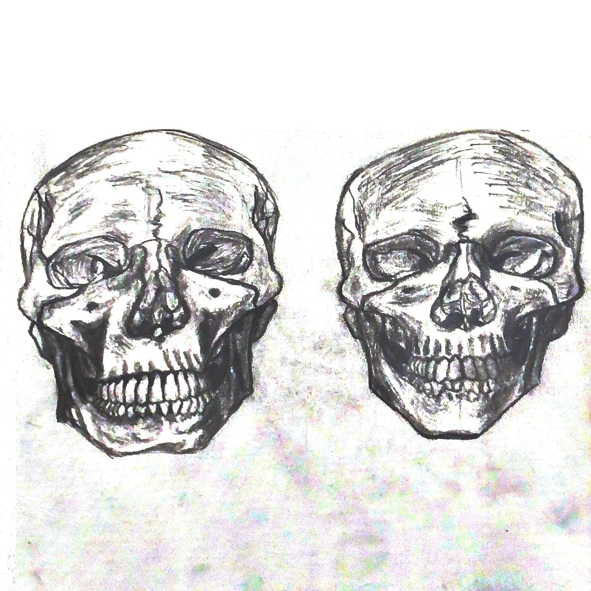
![]()
Skull Anatomy Practice
Context: These sketches were created as part of an anatomy practice to understand the differences between male and female anatomy. I chose to focus on skulls to examine the internal structural variations. The left sketch represents the male skull, and the right represents the female skull. The order from oldest to newest is left, then right.
Medium: Both sketches were done on 9in x 12in sketchbook paper using graphite.
-
![]()
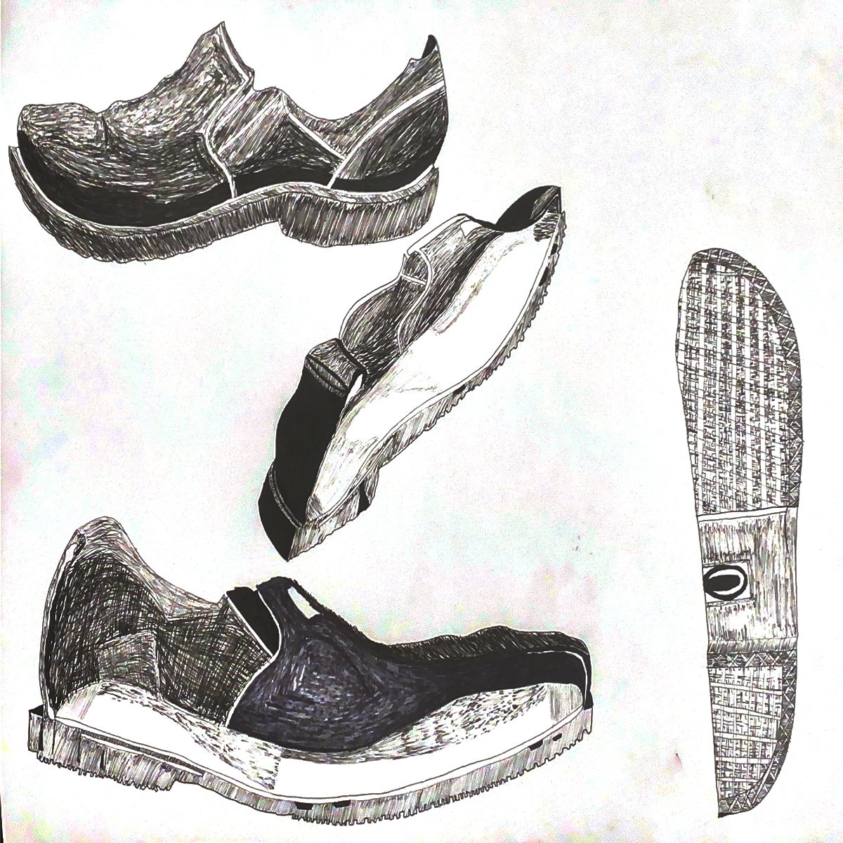
Shoe Perspective
Context: This was a class assignment in where we picked a shoe to cut in half to draw in different perspectives. i thought this would be good practice for experimenting with different ink shading techniques. The order from oldest to newest is; bottom left, top left, bottom right, and middle.
Medium: This was done on 18in x 24in bristol paper with a light pencil drawing beforehand for the ink.
-
![]()
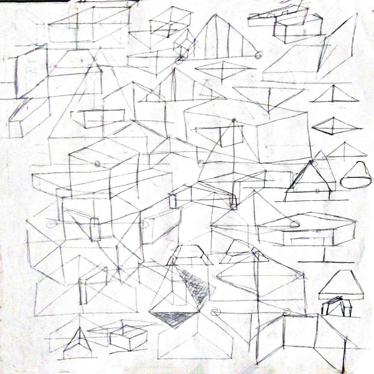
Line Art Architecture Perspective Practice
Context: This exercise focused on architectural line art to improve my perspective and line weight without relying on shading. I chose to use only line work for the architecture to highlight any potential perspective issues immediately. The order from oldest to newest is bottom left to top middle.
Medium: Both pieces were created on 11in x 14in sketchbook paper using graphite.
-
![]()
Shapes & Perspective Practice
Context: This piece was created to practice shapes in different perspectives, following a friend's suggestion to strengthen my foundation by focusing on perspective. I treated this as a brainstorming session, letting the process guide the design.
Medium: Both pieces were done on 9in x 12in sketchbook paper using graphite.
-
![]()
Scotty
Context: I drew this when my friend was feeling tired during a study session. It served as a warm-up to practice capturing mood in a sketch.
Medium: The piece was created on 9in x 12in sketchbook paper, with the entire process done in ink.
-
![]()
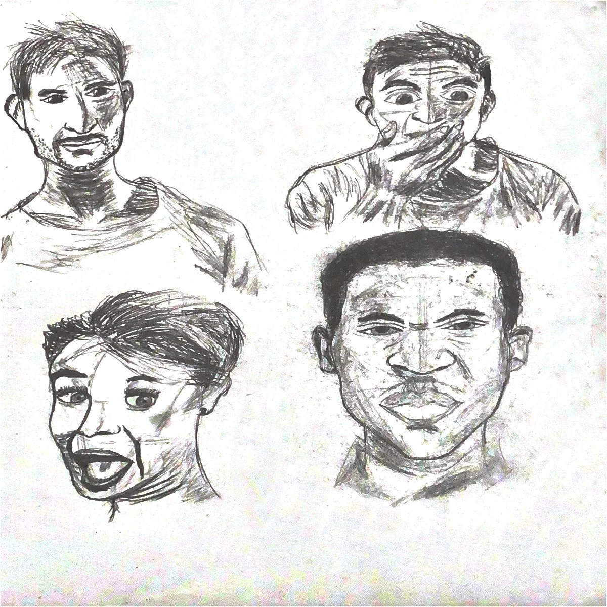
Facial Expression Practice
Context: These were exercises focused on facial expressions to practice human anatomy, specifically the face. I drew a variety of expressions to better understand the consistent movements of the eyes, nose, mouth, and other facial features. The order from oldest to newest is as follows: top left, top right, bottom right, and bottom left.
Medium: These were created on 11in x 14in sketchbook paper using .03 graphite.
-
![]()
5 Minute Timed Single Line Ink Contour
Context: These were two separate 5-minute timed architecture perspective exercises using a single contour line. I chose this approach to practice line variation by limiting myself to one line, especially with ink. The non-erasable nature of ink reinforced the importance of each decision made on the paper. I mirrored the drawings along their x-axis to create a more visually engaging composition.
Medium: These were created on 9in x 12in sketchbook paper using ink. The process was fully completed in ink and then scanned into Photoshop to combine the two pieces into one.
-
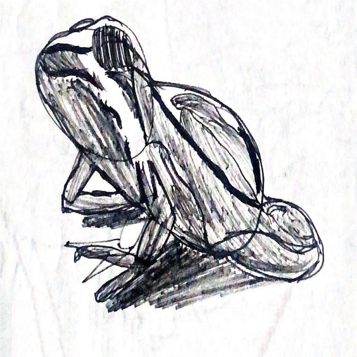
![]()
Amphibian Reptile
Context: This was a timed 20-minute sketch focused on practicing texture and how light interacts with different surfaces. I aimed to better understand the relationship between texture and lighting, enhancing my ability to depict realistic surfaces.
Medium: Created on 9in x 12in sketchbook paper, the entire process was done in ink.
-
![]()
Self-Portrait Mirror Reflection
Context: My art tutor suggested that drawing my reflection in the mirror with only a pen would be a great way to improve my skills. I decided to give it a try and immediately noticed the benefits in training my eye and boosting my confidence in pen strokes.
Medium: Completed on 9in x 12in sketchbook paper, the entire process was done in ink.