Sketching & Research
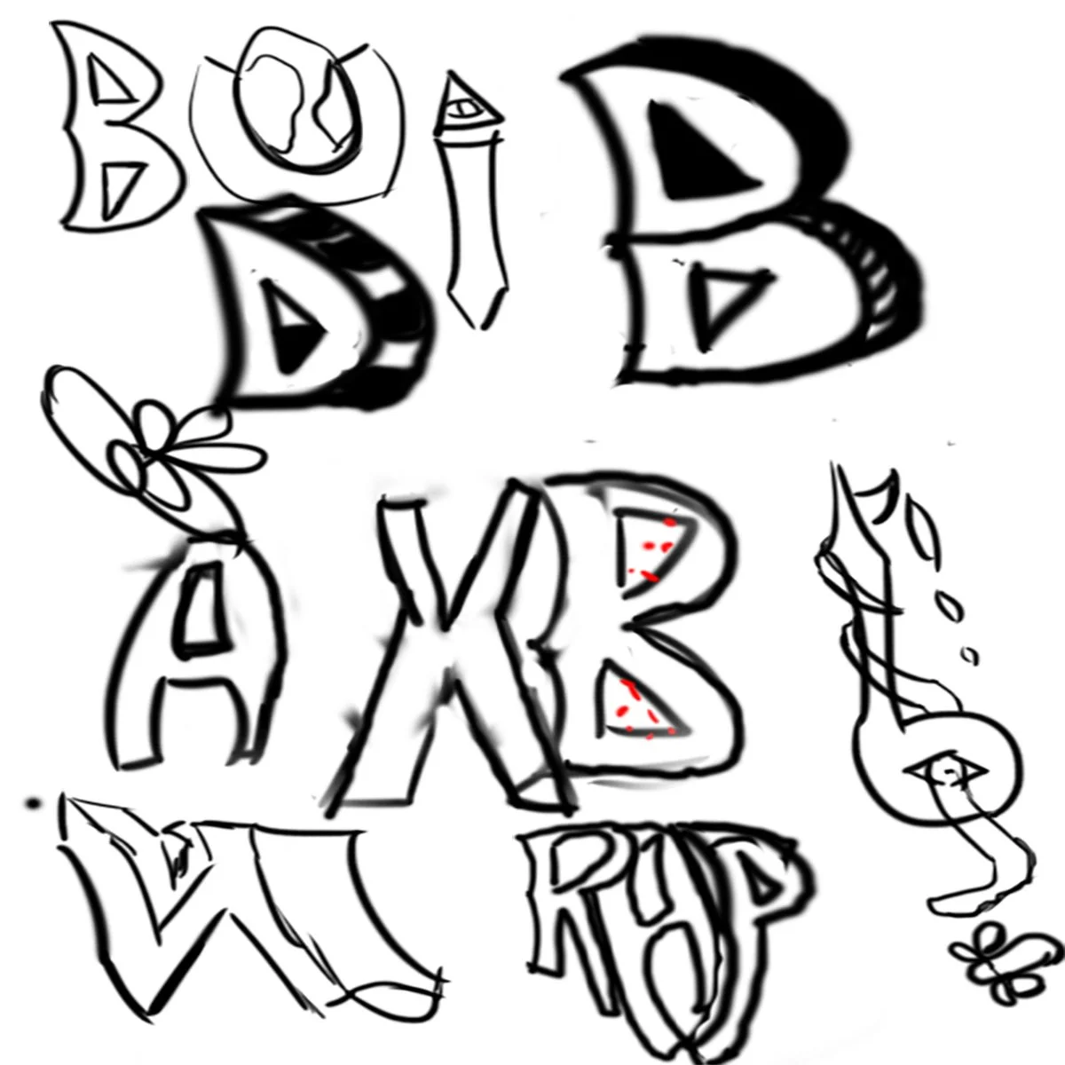
Concept Art 1

Concept Art 2
Concept Art 3

Concept Art 4

These are the initial sketches for the freestyle UI. Concept Art 1 explores various fonts inspired by the hip-hop industry. Concept Art 2 is a refined draft, showcasing UI placements in the top-right photo. Concept Art 3 introduces a red carpet design for the hub world UI, guiding users to the options. Concept Art 4 transitions to a town layout, giving each option its own distinct space. The order from oldest to newest; Concept Art 1, Concept Art 2, Concept Art 3, and Concept 4.
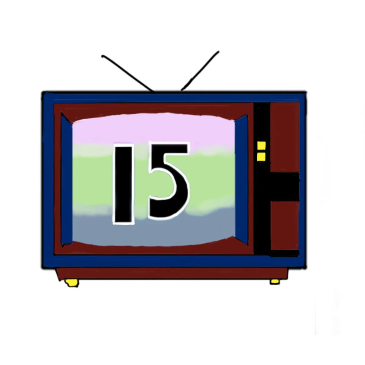
First Draft UI
This first draft of the game icon was designed with an old-school aesthetic, featuring colors and a TV design. However, I found it lacked the intuitive appeal needed for the final design, especially given the small size on a phone and the readability of the numbers.
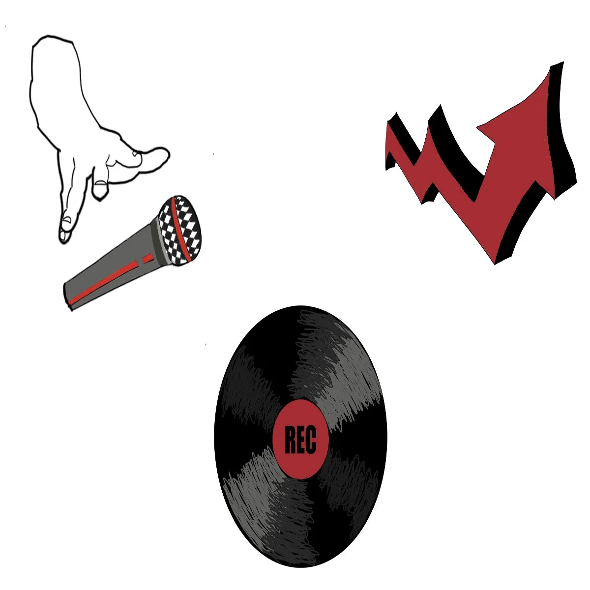
Final Draft UI
On the left is 'quit,' drawn by tracing my hand in the same position. The middle icon represents the record button, inspired by old-school laserdiscs, with scratches adding a raw feel. On the right is the viewers count icon, using an arrow to represent trajectory. My color philosophy focused on neutrals and red, with red symbolizing aggression, rebellion, and passion, balanced by the neutrals. I'm pleased with the final assets, as they effectively capture hip-hop culture through both color and context, such as the mic and laserdisc.