Sketching & Research
Concept Art 1
Concept Art 2
Concept Art 3
To create a retro-modern style for Swerve Hurdle, I researched retro typography, noting its angular, sharp designs and warm tones. For the modern typography, I focused on geometric shapes and cool tones. Concept Art 1 features early sketches for UI assets like time, personal best (PB), and lap. Concept Art 2 refines these assets with a consistent font style. Concept Art 3 illustrates UI placement: the game screen at the top, the result screen in the middle, and the start screen at the bottom. The order from oldest to newest; Concept Art 1, Concept Art 2, and Concept Art 3.
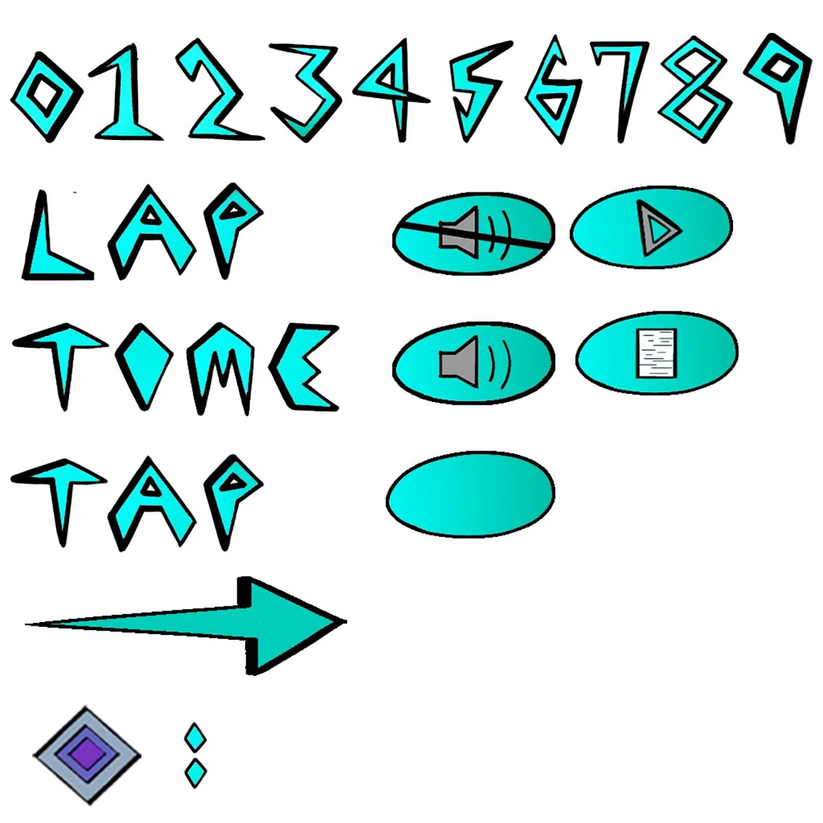
First Draft Typography
After completing the draft, I realized the gradient and font shape design weren’t polished enough for the final product.
Final Draft Sketch
After the first draft, I refined the design to better align with the game. We also removed some words, as they were unnecessary for this stage of development.
Final Draft Typography
This version feels final due to its cohesive shape design and gradient. I’m pleased with it, as it seamlessly blends modern and retro elements to create a unique style for the game.


